I was commissioned to do an in-depth tutorial covering file setup, inking, and coloring as though I am talking to an absolute beginner so here it is! (Because I’ve been waiting for hours for CSP to redownload all the content and I know I won’t finish my updates this week.)
Right-click and open in another window to see the images larger.
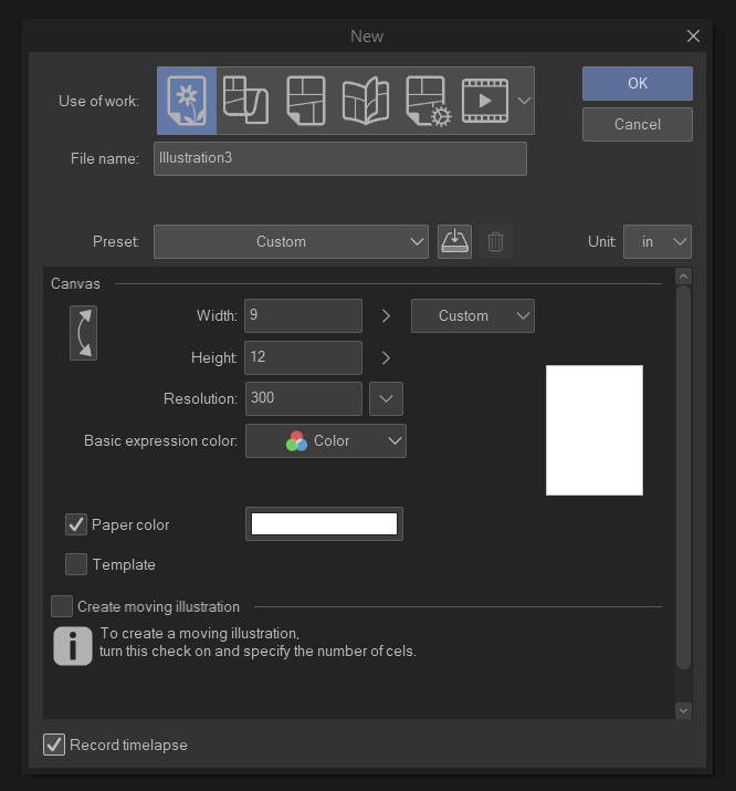
To begin with, this is what you see when you start a new project. Now, each of those icons is a different type of work. The first is for random images and the others are for comics, book layouts, and animation. We’re going with art right now because everything I post from here on can be used under any type of work.
When you create your file, you are offered presets or custom sizes. Letter and A4 are good places to start. They’re self-explanatory. That is the physical dimensions of your canvas. Where people often have a problem is with the Resolution. Commonly, internet resolutions are 72 dpi or 99 PPI. DPI = DOTS per inch as printed by a printer and PPI=PIXELS per inch is the number of pixels as displayed by a computer screen. This is just so you know what the terms mean. 72 DPI is FINE for uploading to the internet, but printing it looks awful. You want 300 DPI minimum for digital art. So make sure your resolution is set to 300 per the example. Choose whatever physical size you want.
Using a higher DPI like 600 is often done for lineart/black and white work, however, using it for color will tax your system resources.
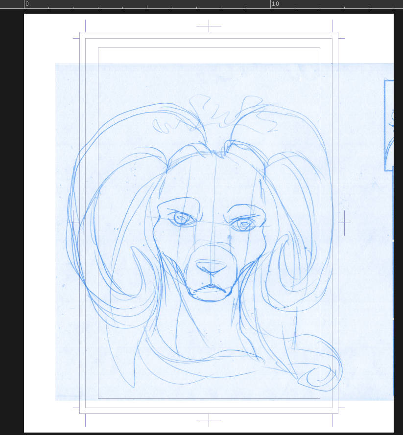
Scan your lineart!
I’m using a basic image that’s one of my chapter title images. I converted it to blue to make it easier to see for inking purposes.
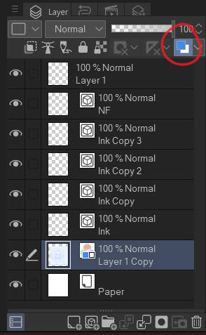
This part is easy and while you can tweak it with other settings, I’m keeping this simple. Just click the blue/white button on the upper right of your layers menu. Typically, the layer menu is on the lower right unless you’ve moved it.
I’ve highlighted the layer I’m on and put it on the bottom, just above the paper.

 Next, and this is very important: LOCK YOUR BLUE PENCIL LAYER! This will save you future headaches in case you forget which layer you’re working on.
The tool is easy to remember, because it is a lock shape. You select any layers you want to avoid working on and select the lock.
Next to it, you see another icon that shows a tiny lock and a transparent background. This locks everything that is not a line. If you have lineart, you can color ONLY the lines on that layer when it is selected. This allows you to do a lot of interesting things, like change the color of your lines or whatever is on that layer. You can use it for silhouttes and shadows by duplicating an entire piece and manipulating it.
 I have no idea if that is a lighthouse or a shrine, but this is the very important REFERENCE toggle. When this selection is on, the layer it is set on is referred to by all other layers. You can do things in other layers that are constrained to what is in the reference layer without using the selection tool.
That’s primarily what I use it for.
The pencil icon is for the DRAFT layer. This is a layer you set to be ignored by the REFERENCE. It’s for things like your pencils so that if you select anything, it won’t pick up that layer and cause a mess. You want it to be ignored when you’re working.
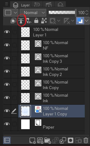
 These are the layers when I begin. They’re as they’re described, a layer that does different things. You have a base layer, your pencil layer, then VECTOR layers for inking. You can add more of those by using the icon on the bottom middle with the matching box next to the folder.
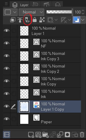
Your choice is Vector or Raster, however, Vector is superior for many reasons. Vectors allow you to individually control the lines through control points if you want. (Not that difficult once you get used to it, but not going into that now. Perhaps in another tutorial.) The primary reason I’m showing them to you here is for easily erasing stray lines.
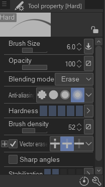
When you select your hard eraser, it has an option called Vector Erase. Turn it on and selecting the middle icon will delete all lines you choose to erase to the next vector line. This is a time saving tool when you’re cleaning up your lineart!
Typically, I create inking layers and then a layer I call NF. NF=No Flat. This is a layer I set up for tiny details that make flatting (filling everything with color) more time-consuming. It remains loose, on top of everything else, whereas I combine the other layers when I’m done.
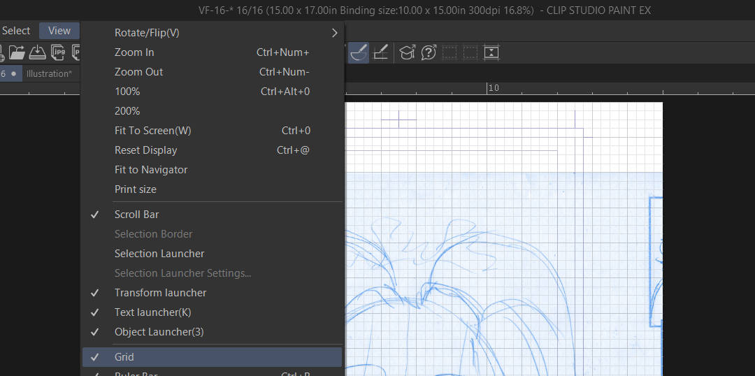
Next, I turn on the GRID for the document. This is important to keep things like eyes even and cut down on misalignments.
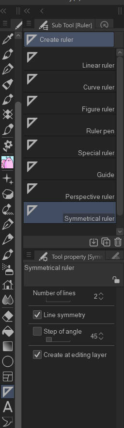
This step is a bonus. I rarely use it for art like this, however, my girl here is facing forward and it will make getting her horns and face more inline.
This is the symmetrical ruler. For my use, I’ve set it to TWO lines. This will make a mirror image. You don’t have to change anything else.
If you increase the lines, you can create fancy geometric designs and creative snowflakes. It’s also just fun to toy with and see what kind of kaleidoscope you can make.
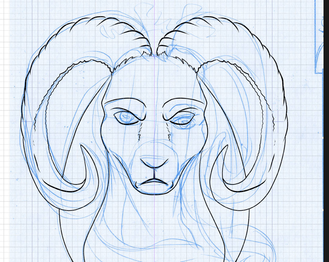
See that faint pink line in the middle? When I created the symmetry line, it asks you immediately to place it. This takes practice but is easy to do. (My steps got a little mixed up here, sorry about that. As you see, I already began inking. I forgot to take a screencap of the line. 😀
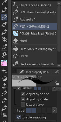
You have to make an adjustment to your drawing tool before you begin. This is my favorite pen to ink with, Via Bryan Allen who has a ton of awesome brushes. They are also far too cheap at $9.00 for ALL of the ones he’s created so far.
The toggle you have to select is ENABLE SNAPPING at the very bottom. If you don’t see it, you have to add it using the Window > Sub Tool Detail settings.
This selection will snap your lines to a ruler, any ruler you have active. In this case, it’s the symmetry ruler, and it creates mirror images as mentioned above.
Notice that I did not do the entire image this way, only the facing part. I’m not doing the hair, because it would look unnatural to have the hair a perfect mirror, and not doing a few details here and there also makes it less noticeable it’s a mirror image. The horns, eyes, and face are the most important parts for symmetry’s sake. Symmetry=perfection. Asymmetry=imperfection.
 When you finish inking, select your inking layers and flat them together, right click > Merge Selected layers.
This is simply to make your work area neat and clean.
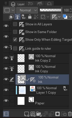
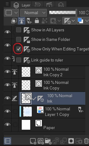
Next, if you used a ruler, you go up to the dropdown with the ruler on it and unselect show only when editing target so the ruler goes away.
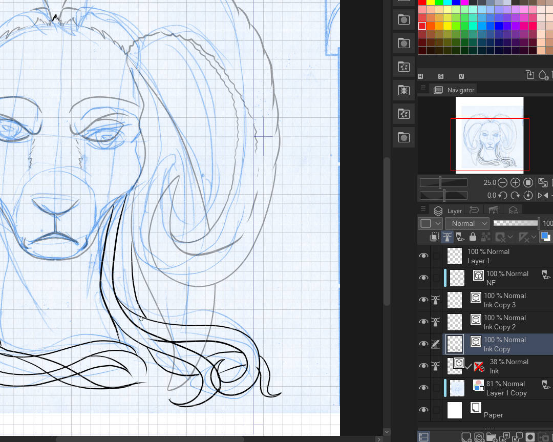
I added new vector layers and went to inking that hair! SEE all those lines that are crossing? They’re on different layers. Yes, I could have it all on one layer, but it makes it tricker to delete stray lines. This way, I take my vector eraser as I showed you earlier and remove all the lines I don’t need on their individual layers.

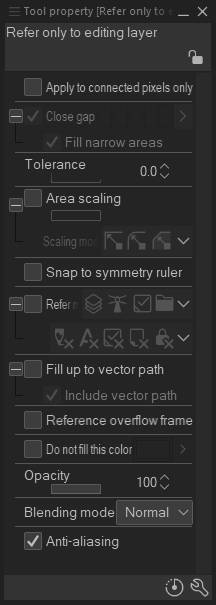
All nice and clean. There are gaps! See them? You don’t have to worry about them, because you can fill the spaces without closing them. If you do want to fix them, you can simply draw in the missing space, or …
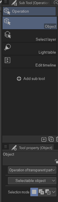
I select this tool on the upper left hand menu. It’s the object tool and you use it to select Vector lines and edit them.
Select the line and you SHOULD see dots. Grab a dot by clicking on it and you can adjust it into a variety of positions and close the gap.
This should be another lesson, how to mess with Vectors. Unfortunately, my copy of CSP is giving me pains right now and I can’t even create a visual and I forgot to screencap this one! It should be self-explanatory, if not, say something.
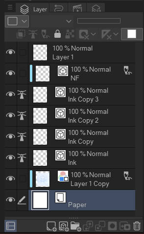
From here, flatten your inking layers, all except the one that says NF.
![]()
Next, you want to create a new layer beneath your lineart. It’s just a black layer to help you with the next steps when we begin coloring.
Just grab your fill bucket and make sure everything is toggled off and fill it in with black and turn off your paper layer. It makes the background mostly transparent so you can see where gaps are better.
And that’s it for part one, Inking! If you have questions about something concerning inking that I might have missed or wasn’t clear about, please let me know.
This is, btw, how I ink and prepare art. There are many ways to do this and this is simply one of them.
- Tiff